


Great Games Need Great Layout
#004 - Proof that layout is not only about making books pretty


Have you ever wondered why some OSR games hook you instantly, while others just feel… okay? For me, the answer is always the same: it’s the perfect mix of a great game idea, written by an inspired author, and paired with an exceptional layout. If one of these elements is missing, the game will struggle to stand out. But what makes a layout truly great?
From my perspective as a graphic designer, it’s more than just aesthetics—it’s about crafting an experience. Let me explain.

Why Is Layout So Important?
When I talk about layout, I mean the entire graphic design experience. It’s about the format, paper quality, colors, typography (fonts, spacing, etc.), composition, illustrations, and other design elements.
Imagine holding a new book in your hands: a sturdy hardcover with cutouts and embossed details, special finishes that catch the light, and thick, textured paper inside. The layout is filled with beautiful illustrations and well-designed maps for the GM and the players, along with easy-to-read and fun tables that make running the game effortless. You’d love it, right? But only if the game itself excites you—otherwise, it’s just a pretty shell.
Now, imagine the opposite: take a fantastic game you love, like as Mörk Borg, Pirate Borg, Dolmenwood, or Mothership, and strip it down to a plain 100-page Word document—no headings, no paragraphs, no illustrations. Would you really enjoy reading or running it the same way you do now? I certainly wouldn’t.
Layout Is Not Just About Looking Pretty
If you believe that layout is just about making things look beautiful with sparkling butterflies, I hate to break it to you—but that’s not the case. It has to be thoughtful. The art style must fit the game’s atmosphere, and every design choice should reinforce the intended experience.
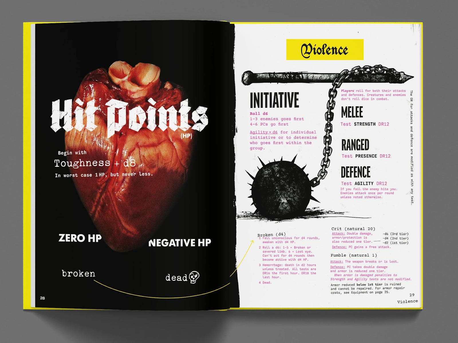
Would you say Mörk Borg by Pelle Nilsson and Johan Nohr is a classic beauty? No, it’s not. Does it look great because of the thoughtful layout and loud art? Fuck, yes! The visual style is an extension of the game itself, pulling you into its dark, punk-inspired world before you even roll a die.
When I look at any book, zine, pamphlet, (or whatever), I consider a few key aspects:
What is the core idea of the product?
If I can’t figure this out after a few seconds or after reading the first pages, I probably won’t keep reading. That might sound harsh, but I need a clear message conveyed to get hooked.Does the art style match the product’s message while creating the right atmosphere?
If yes—great. I’m starting to warm up to it.What kind of fonts are used?
Do they align with both the art style and the game’s message? If yes and if I like them, I’ll probably want to know where to get them! I’m a graphic designer—I can never have enough fonts!
Are the fonts easy to read?
Don’t get me wrong: great headlines written with decorative fonts can be stunning! But they’re even better, when I can actually decipher them. Sometimes, poor line spacing or cramped font choices can turn a beautifully designed piece into a frustrating experience.Are there layout rules, and how consistently are they applied?
This might seem like an odd question to those who don’t often think about design. There are rules for layouts? After all. isn’t it all just art? Well, not exactly. Or not just art.Layout isn’t just about creating something visually striking—it’s a deliberate process, governed by rules that ensure clarity and functionality. Good design is hard work—and that’s exactly what I mean when I say layout needs to be thoughtful.
Usability Is The Key
There is one layout rule that stands above all else: It must be easy to use at the table!
At first I didn’t quite get it. I was used to how other, non-OSR TTRPG books are compiled, and some of them—though not all, of course—aren’t particularly well-thought-out. They work like this:
“You want to play in this cool new city? Sure! Check pages 2-15, 36, 87 and 212 for about 70% of what you need! Everything else is scattered across another fancy book you’ll need to buy—coming soon.”
That’s exactly what sets many OSR books apart from most other TTRPGs I know. All the information you need is in one place. When you play, you don’t have to dig through multiple sources. Everything is there in a well-organized, easily accessible format. How? Through thoughtful and functional layout, of course!
Every page and spread serves a purpose. My brother and I are constantly debating how to approach new spreads. When we work on a new location, for example, we aim to fit all the necessary information to run it on a single spread. If we have to split it across multiple spreads, it needs to be for a good reason—and we make sure to design it in a way that’s still easy to navigate at the table.
Layout Rules: Make Them. Establish Them. Break Them.
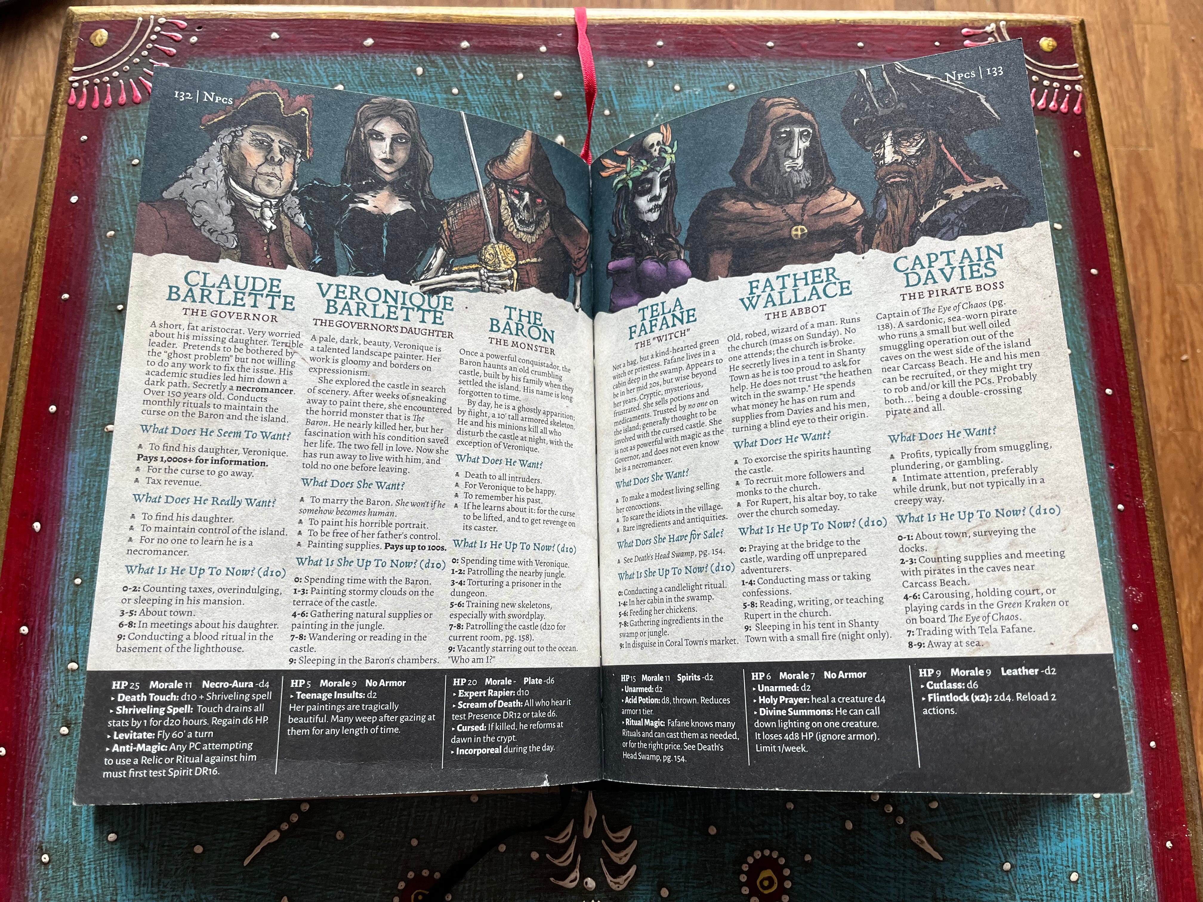
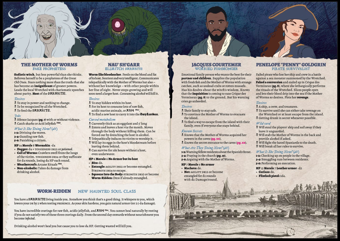
Let’s take a look at an example. This is a NPC spread from Pirate Borg’s introductory adventure The Curse of Skeleton Point, written and designed by Luke Stratton (Limithron).
When we began working on our adventure The Way of the Worm for the Cabin Fever jam, I studied the layout of the Pirate Borg core book closely. The first thing I noticed was Luke Stratton’s unique art style—and I quickly realized I couldn’t just replicate it. But I could capture the atmosphere and understand how the layout worked.
To nail the style, we used a lot of old paper textures for our project, just like Luke does, to evoke the same gritty feel of the game. Additionally, most of the body text in the game is written in the same font—Alegreya, in case you’re curious. I dove into Pirate Borg’s (freely available) Design Primer and core book to study the spacing (between lines, paragraphs, etc.), headline fonts, bullet point styles, and other formatting details. Then, I looked at how NPC stats were formatted, when to switch headline fonts, how to highlight key elements, and how to structure tables.
Our very first project aimed to emulate Pirate Borg’s style—and after that, we made subtle changes to make it our own.
To create this spread, we had to make a few decisions:
Where should the text go?
Which information do we need on this spread?
How much text can fit on a page without overcrowding it?
Where should the illustrations be placed?
How large can the illustrations be?

The first draft was essentially just text—no fonts, no colors, no highlights, or anything else. It was basic, but it gave us a starting point to work with. And we learned what information the spread should convey. This gave us an idea of how many white spaces the draft text would leave that needed to be filled.


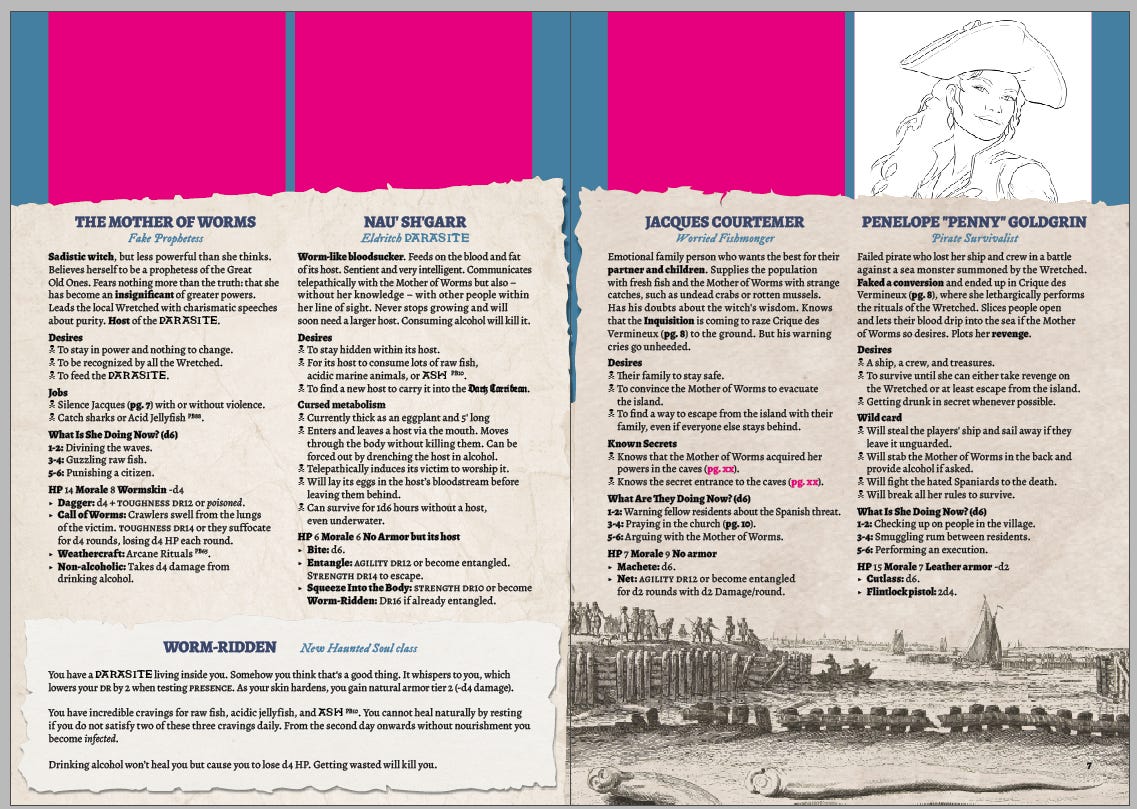
Early layout experiments: finding space for illustrations, ensuring readability, and trimming unnecessary text. But what was the problem with these two drafts?
The first one, with the magenta blocks for images on the outside, was a layout idea inspired by a spread of a Mothership module. I still think the concept is pretty cool, but there were some issues:
First, the new class had to fit in somehow. Whatever I did, one page ended up overflowing with text. The alternative would have been to cut some content, but that would have resulted in the remaining two characters having more text than the others, making them seem more important.
Second, the layout reminded me of Mothership, not Pirate Borg. That’s why layout idea No. 1 wasn’t a viable option.
The second idea aimed to fit three characters on one page, giving the class more space to stand out. That could have worked—if we had had only three characters. But the fourth one became an issue. They had significantly more space than the others, which could have made them appear more important—essentially the same problem as before.
We needed a different solution.

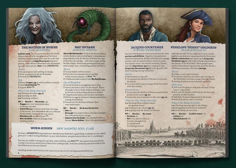
After some attempts, we opted for a structure that readers would immediately recognize from Pirate Borg, but felt less cramped—only four instead of six NPCs, plus information on one class.
… and finally…
… it worked!
After experimenting with different layouts and placements, we figured it out. We placed the text where it was most readable, used the illustrations to highlight key areas, and made sure everything had its place without overwhelming the page. It clearly felt like Pirate Borg and maintained high usability for the readers.
The Power of Thoughtful Layout
Thoughtful layout is more than just aesthetics—it’s about usability, clarity, and enhancing the overall experience of the game. It ensures that information is easy to access, that the design strengthens the theme, and that players and GMs can focus on playing the game rather than searching for details. A well-structured layout makes the difference between a book that sits on the shelf and one that is brought to the table.
When you pick up a TTRPG book that you absolutely love, there was almost certainly a dedicated designer behind it—someone who spent the time and effort creating a layout that enhances the gaming experience. It’s thoughtful, intentional, hard work. And for me? I wouldn’t want to do anything else.
“From pebble to monolith—your journey matters. The Golems have spoken.”
Sabrina “Nina” from Golem Productions
 | A guest post by
|
I’ll need to hold on to this one as a reference
Great job articulating the thought process that goes behind making supplements for TTRPGs! I liked following your process for this particular spread. This will be helpful as I put together a Shadowdark supplement!
If you haven’t already, you should check out Explorer’s Design. They discuss layout and design of TTRPGs at length. I’ve been following them for quite a while and they always have useful information in a hyper-niche area!