


Typography Is Fashion for Words
#007 - Lorem ipsum dolor sit, folks! Or: Let's talk about fonts in RPGs!


No, I didn’t just insult you in Latin. What you just read is dummy text—a placeholder used when the actual content isn’t ready yet. It has no meaning and was created to help typographers and designers focus on fonts and layouts without being distracted by the words themselves.
This is part 1 of... well, I don’t know yet. There’s a lot to say about fonts, and all I want to do is share some basics from my point of view.
Why Fonts Matter
Some might ask: Why bother? Can’t you just open Word or Google Docs, add some nice illustrations, and call it a day?
Remember when we talked about thoughtful layout last time? I’d argue that at least 50% of your layout comes down to how you handle text. Why? Because every font has its own personality.
The right font for the right message
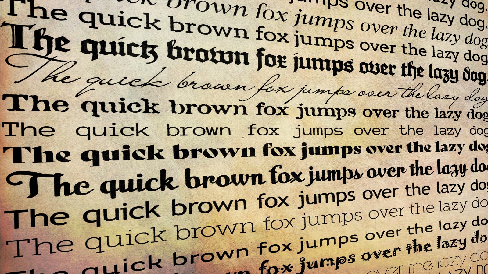
When analyzing fonts, the first thing to consider is their shapes and how they influence what we associate with them.
Round shapes feel organic and friendly.
Sharp-edged fonts appear more technical and precise.
Thick strokes make a bold statement, while thin ones feel more elegant.
Some fonts have serifs (the small “feet” on the ends of letters), while others don’t—or they might be cursive!
A great question from my design teacher stuck with me:
“What kind of font would you use for a wedding invitation, a funeral announcement, and a kindergarten poster?”
If you can answer that, you’ve understood the basics of typography. (And for all the font nerds out there: Don’t say Helvetica! Yeah, I know—you could use it for everything. We all had that phase. But that’s not the point!)
Choosing the right font
Let’s start with a wedding invitation. You want something elegant, maybe a little fancy, with a personal touch.
Elegance? That calls for tall, slim letters.
A dynamic look? A mix of thick and thin strokes works well.
A classic touch? Add serifs.
A personal feel? Consider cursive like Timberline for the couple’s names.
A funeral announcement, on the other hand, has a much heavier, more somber tone.
It should feel serious, maybe even a bit weighty.
An extended, bold font can emphasize that gravity.
Serifs might add a formal, traditional touch, but they’re not a must—try Cambria Bold.
And then there’s the kindergarten flyer. It’s about fun, energy, and creativity!
Forget serifs—they’re too rigid.
The font should feel playful and organic.
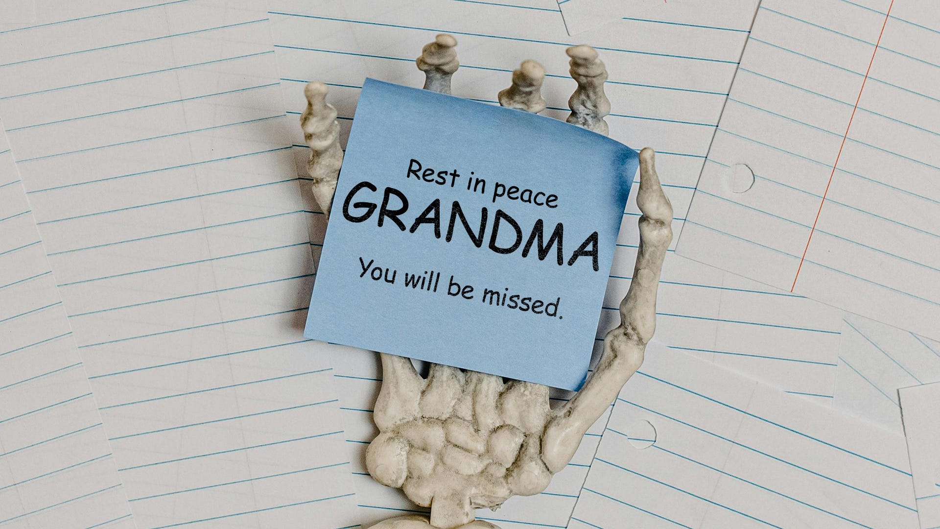
Comic Sans (yes, the one I used in the Grandma example earlier) actually fits here!
Enough theory—let’s look at some real-world examples: TTRPGs!
Even though it’s not OSR, let’s examine a game that makes bold typographic choices: Eat the Reich!
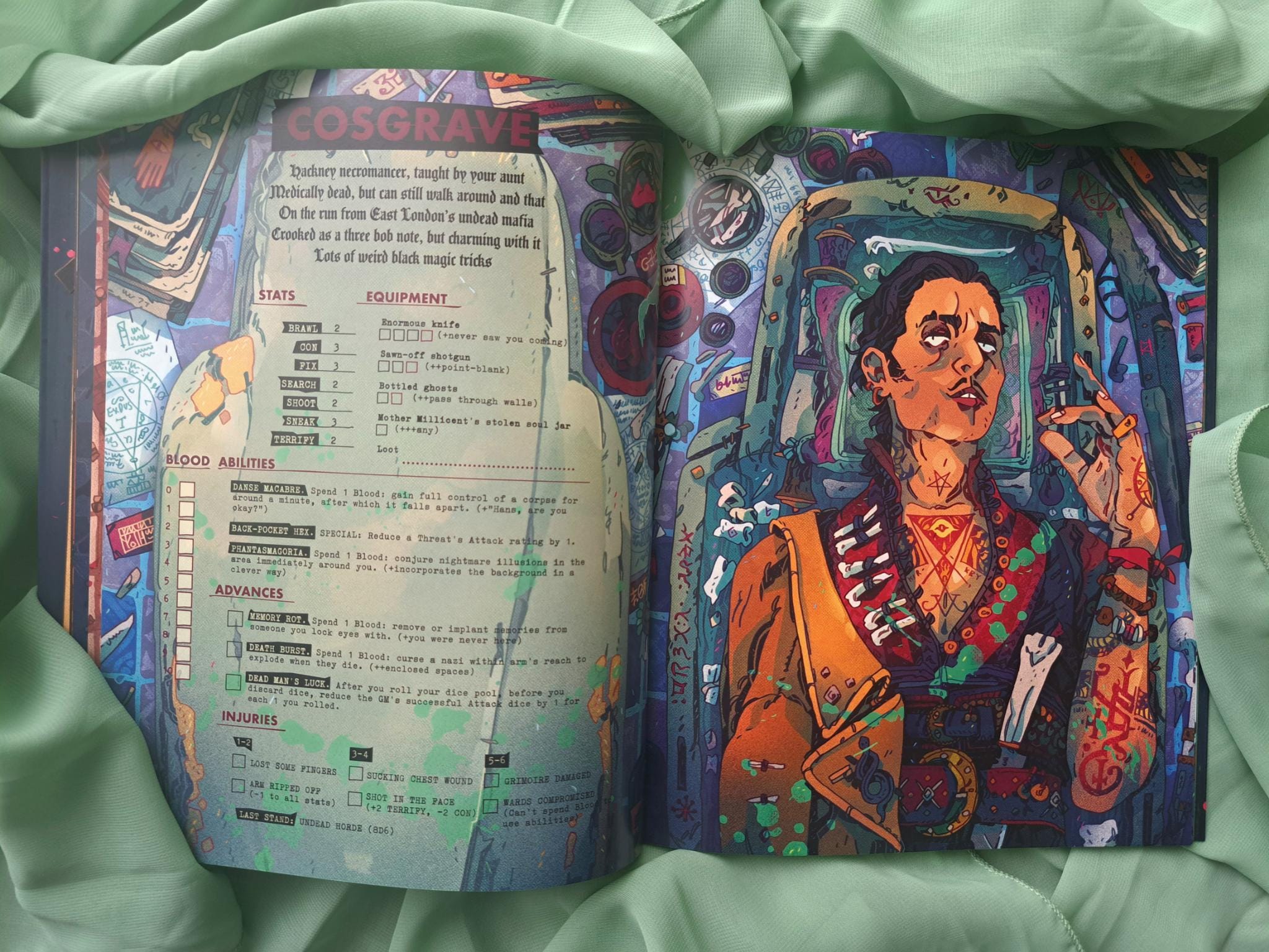
Just look at this gorgeous spread—especially the typography. The body text is set in a monospaced font, mimicking the look of a typewritten report. That makes perfect sense if you think of the book as a collection of wartime records. Yet, despite this vintage inspiration, the design still feels modern.
How does it pull that off?
Headlines use a clean sans-serif. Though sans-serifs date back to the 18th century, they became dominant in the 20th—and still define contemporary design.
A fractured, historical typeface adds contrast without making the layout feel outdated.
Mixing three distinct fonts is a very modern choice, creating depth and character while keeping the design fresh.
And Here’s How to Get It Wrong
Don’t get me wrong: I love cursive! But no matter what font you use, it must be readable. With most cursive fonts, you’ll have a hard time reading them when they’re used for body text. But as headlines, they can be gorgeous. Other fonts are simply too complex to be decipherable—especially when they don’t have enough whitespace to breathe.
Don’t choose a font just because it looks fancy! Use it because it suits the purpose. If you’re unsure whether your layout works, ask someone for honest feedback and check if they can read everything easily. And don’t worry—everyone has to do this. I still struggle with contrasts when setting backgrounds and fonts sometimes. But paying attention to these details is the only way to improve.
So, what’s the perfect font for your project?
There’s no single answer. As you can see, fonts should be chosen as carefully as your clothes. You wouldn’t sit on your couch in a suit to binge-watch something—just like you wouldn’t show up to an important meeting in a T-shirt and cap.
Just ask yourself: What would your text wear to suit the given context? Look at the shapes, find associations, check out other RPGs, and get inspired. You’ll find the answer!
And it can be fun, too! When I start a new project, fonts are the first thing I think about, and I can spend hours searching for the right one. But it’s always worth it.
Speaking of which, I can’t wait to pick fonts for a weird Borg project my brother and I have been discussing. But shhh—he doesn’t know I mentioned it here. 😉
“From pebble to monolith—your journey matters. The Golems have spoken.”
Sabrina “Nina” from Golem Productions
 | A guest post by
|
Great article. I like that you explained everything without being too technical. Totally agree fonts are a lot of fun. I think it is more fun when you turn them to outlines and play with their shape or add points. But that is more advanced design stuff then what your covering here.
And now, let’s talk about oversized Montserrat in Medfan TTRPG.